Are you tired of your website’s lackluster performance? Do you find yourself wondering why visitors are not turning into customers? Well, it’s time to unlock the secrets of conversion rate optimization strategies that will boost your conversions!
Imagine you’re out on a date, looking your best and saying all the right things. It seems like the date went great, and you’re all set for another exciting night out next week.
But they don’t call you back. You wait and wait but don’t hear from them.
Seeing a dipping website conversion rate is the same feeling.
We know that you spent a great amount of effort to get the visitors in the first place but not seeing conversions has left you incredibly frustrated.
We get it.
Let us tell you that getting visitors is a great start, and you can turn them into paying customers by implementing conversion rate optimization strategies.
How do you do that? Well, you read this blog till the end and apply the conversion rate optimization strategies right away.
Let’s get right in!
What is the Meaning of Conversion Rate Optimization, and How To Calculate It?

Conversion Rate Optimization (CRO) is a tactic used by marketers to enhance visitors’ experience on the website or their related channels. This experience further encourages the visitors to take a desired action that aligns with the business goals, which, in other words, can be called conversion.
Conversion rate optimization strategies play a pivotal role in your online presence. These are the critical moments when a casual website visitor becomes a paying customer in your online store.
But, the conversions are not only limited to making a final purchase; they occur at various stages leading up to that critical moment.
For example, a conversion on your homepage might get a visitor to click on a product. A conversion on a product page could be when someone adds an item to their shopping cart.
CRO is a broad topic because it affects many parts of your website and online marketing.
Let’s see five areas where CRO can help businesses:
- Homepage: This is like the front door of your website. You can use CRO to make visitors more likely to explore and shop.
- Product pages: These pages show off your products. CRO can help make visitors more likely to buy.
- Landing pages: These are special pages for specific ads or campaigns. CRO makes sure these pages are super effective.
- Checkout process: Conversion rate optimization strategies can help make it easier for visitors to buy things from your site.
- Category pages: These are where visitors browse related products. CRO can help them find things they want to buy.
To boost conversions in your online store, you should continuously test every aspect of your website’s personalization with the help of different techniques like A/B testing.
How to Calculate The Conversion Rate
The conversion rate is determined by taking the number of desired actions (conversions) and dividing it by the total number of visitors. To express this as a percentage, you multiply the result by 100.
Conversion Rate = Number of Conversions
———————————- X 100
Total Number of Visitors
Example, if your website had 200 visitors in a month and 10 of them made a purchase, you would calculate your conversion rate by dividing 10 by 200, resulting in 0.05. When you multiply this by 100, it gives you a 5% conversion rate.
Why is Conversion Rate Optimization Strategies Important?
As digital marketers, our sheer focus is driving more traffic towards our website. We do this with the hope that more visitors will result in more conversions. However, it’s like attempting to keep a balloon inflated with a hole in it.
However, the road to success lies in fixing that hole and making the most out of the visitors for whom we have invested our valuable time and energy to attract. This is when conversion rate optimization strategies comes into play.
Let’s move further and understand why conversion rate optimization is so important in growth marketing and why it should be a paramount objective for businesses in the drive for online success.
- Enhancing User Experience

As a user, we know how frustrating it is to navigate through poorly designed websites. Whenever we come around such websites, chances are that we may take the exit route soon without making any purchases.
On the other hand, a well-optimized website is easy to navigate, providing a seamless experience and guiding the users straightaway to what they seek. This also holds true for your website’s customers.
The customers happy with your website will not only make a purchase but will also recommend them to others and return for more.
- Boosting Return on Investment
Digital marketing can prove to be a significant expense, particularly for businesses operating on restricted budgets. Conversion rate optimization strategies empowers you to elevate your conversion rate and generate added returns. This is achieved without increasing your marketing costs, ultimately resulting in an enhanced ROI
- Having the Edge over Competitors
The competition is fierce in the expansive digital landscape, requiring you to go the extra mile to differentiate your business from the rest. To set yourself apart, it’s essential to provide a user experience that caters specifically to your potential customers.
An optimized website gives you an edge by helping you attract and keep more customers than your competitors.
- Trimming Customer Acquisition Expenses
Getting new customers can cost a lot. But when your conversion process is effective, you don’t have to spend as much to get them.
By giving attention to conversion rate optimization strategies, you can reduce what it costs to bring in customers and have extra money to put into important parts of your business, like making your products better or offering better customer support.
- Enhancing Brand Reputation
Nowadays, where people spend more time on their screens, your website often serves as an opening connection point between your brand and potential customers. A seamless and enjoyable user experience increases conversion chances and enhances your brand’s overall perception.
When your website excels in delivering a positive user experience, you hold the advantage. This positive encounter builds trust in your brand and has the potential to turn visitors into loyal customers.
They will also share their positive experience with others, which will be beneficial for the reputation of your brand.
Considering all the above factors, it becomes evident that it should be a fundamental component of every online business strategy.
Let’s delve further and understand how Conversion Rate Optimization strategies works in uplifting your online business.
How Does Conversion Rate Optimization Strategies Work?
CRO operates on a simple principle: addition and subtraction where necessary. This means a CRO strategy may involve adding elements such as a compelling CTA button, improved content, or a testimonial in specific sections.
Conversely, it may also entail removing elements that don’t contribute to conversion goals. Anything that doesn’t aid in achieving a conversion has no place on your website.
Before embarking on your conversion rate optimization strategies efforts, it’s essential to pose the right questions, like:
- What do you want to achieve?
- What are your desired outcomes?
- Who are your customers?
- How does your current website stand unique against others?
These questions help you define your objectives and determine the most effective CRO strategy for your website. Ask yourself these questions and then look at your current site with fresh eyes and assess its conversion-friendliness.
You’ll likely discover multiple areas that could benefit from enhancement. Evaluate competitors’ websites and social channels to identify potential gaps in your online presence.
Now that you know the loopholes that need to be filled let’s make a CRO plan to improve your conversion strategy. However, the CRO plan may differ from business to business; we can broadly categorize it into five different stages. Let’s explore each one of them in detail.
Stages of Conversion Rate Optimization
Conversion Rate Optimization (CRO) typically involves several stages to systematically improve a website’s or digital platform’s conversion rate. Here are the common stages of conversion rate optimization strategies.
- Research
In this phase, you have to understand the user behavior in your online store. You can collect this data using tools such as Google Analytics, customer surveys, usability tests, and user interviews.
- Hypothesis Development
Based on the data you’ve acquired, generate hypotheses for potential improvements. For instance, you might hypothesize that incorporating customer testimonials on product pages can boost conversions by building trust and providing social proof.
- Prioritization
Decide which hypotheses to test first. Focus on pages that can have the most significant impact on your growth. Prioritize those that may be underperforming or have straightforward enhancements to expedite conversion rate improvements.
- Testing
Put your hypotheses to the test. To gauge their effectiveness, implement changes systematically, such as through A/B tests or split testing.
- Analysis and Learning
After conducting tests, analyze the results. Determine whether a change should become a permanent part of your site. If not, use the insights gained to understand why it didn’t work and apply those lessons to future experiments.
Are you prepared to initiate your conversion rate optimization strategies journey within your company? Examine the strategies provided below and start with your experimentation.
7 Effective Conversion Rate Optimization Strategies

Here are some practical marketing strategies for conversion rate optimization that you can consider testing and implementing within your organization.
1. Make Your CTAs Work
If you’re looking to boost conversions, CTAs are the easy wins. But it doesn’t mean that inserting a CTA in your blog is all that you need to do. There are many factors like placement, copy, colors, button shape, and button size that affect your conversion based on CTA.
Here are some tips to get your CTAs to work right away:
- Make the Purpose of the Button Clear
Use clear and short text on your button to tell users what it’s for and what they should do.
- Use Contrasting Colors
Make sure the button stands out using a color different from the background.
- The Button Should Be Easy to Find
Put the button where users can easily see and reach it, like at the top of the page or near any important information.
- The Button Should Be Actionable
Use words that tell users to do something, like ‘Buy now’ or ‘Sign up.’
- A/B Testing
Keep trying different button designs, positions, and words. See what works best, and keep improving.
How Grammarly is Acing It

CTA: Get Grammarly It’s Free
Because the CTA is easily noticeable and surrounded by ample white space, it naturally guides visitors’ attention toward the desired action.
Additionally, the inclusion of “It’s free” in the CTA is a highly effective strategy to influence user decisions.
The page’s design is straightforward and uncluttered, allowing for a clear view of all elements and making the CTA particularly significant.
2. Run Tests on Your Landing Pages
Landing page testing involves conducting a series of experiments on various versions of landing pages to identify the most successful one. This is determined by the page that achieves the highest number of conversions or goal completions during the experiment.
There are 2 approaches to landing-page tests you should consider:
- A/B Tests
A/B testing, often called split testing, is a method where two landing page versions, A and B, are developed. Half of the traffic is directed to A, and the remaining half to B. After the test, the variant with the most conversions is declared the winner.
For instance, if A yields more conversions than B, A is the winner.
- Multivariate Tests
Multivariate testing, like A/B testing, follows a similar method. However, it tests multiple elements and creates different variant pages for these tests. The winner is decided based on the number of conversions.
For instance, if variant C gets more conversions than A, B, and D, then C is declared the winner.
3. Simplify the Form-Filling Process
Website forms have various purposes, such as signing up for newsletters, obtaining lead magnets, or making product/service inquiries. However, many people often abandon the form-filling process for several reasons, including:
- They worry about their information being safe.
- Ads that get in the way can be annoying.
- Pushy sales tactics can be frustrating.
- Some forms don’t work well on phones.
- Forms with lots of questions can feel overwhelming.
Remember, your forms must be to the point, not too short, not too long. To ensure your forms are user-friendly, keep the following points in mind:
- Clearly label form fields.
- Utilize proper HTML formatting.
- Employ relevant placeholder text, such as “Your website URL.”
- Include a distinct and easily locatable submission button.
- Keep your forms concise, emphasizing essential information like name and email address.
Example,

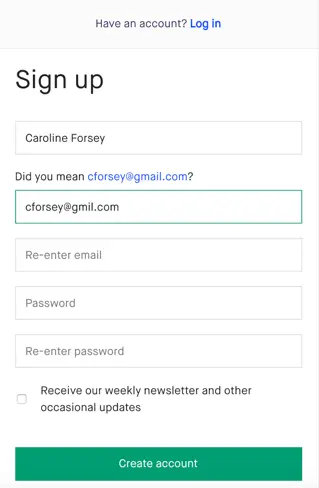
Kickstarter’s registration form is simple and features a clean white background, ensuring your attention is on the essential form fields. Moreover, it’s designed to request only necessary information, making it ideal for engaging a busy audience.
4. Use Pop-Ups Carefully
Pop-ups walk a tightrope between being genuinely helpful and being incredibly annoying. However, when executed correctly, pop-ups can become an invaluable tool for boosting conversions.
The foundation of effective pop-ups lies in adhering to universal UX (user experience) principles. This means ensuring swift loading times, providing easily accessible exit options, and designing pop-ups that are suitable for the platform they appear on.
It’s also crucial to set limitations on how frequently users encounter pop-ups. For instance, if visitors dismiss a pop-up once, bombarding them with it on every page they visit is counterproductive. It’s important to realize that not all pop-ups are equal, especially on mobile devices.
So, carefully examine your pop-ups to ensure they assist your objectives without bothering your users. When your goal is to increase conversions, keep your pop-up messages concise and transparent, making it easy for visitors to act.
Consider implementing A/B testing to gauge how users interact with various versions of the pop-up. This is a critical step in the broader context of conversion rate optimization.
Example

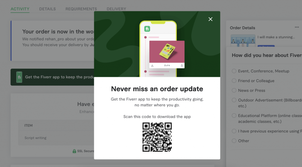
Fiverr’s website displays a popup right after a user subscribes to their software, prompting new users to download their app as well. The inclusion of a QR code in the popup simplifies the app download process on mobile devices, potentially boosting their campaign’s conversion rate.
5. Send Abandoned Cart Emails
Unfortunately, there are times when shoppers load up their carts with items and then exit your store with no plans to return due to many reasons, such as a discount code no longer valid or high shipping rates.
Abandoned cart emails enable you to jog the memory of those customers who have shown interest in certain items and give them a little nudge to return to your store to complete the purchase.
6. Check Your Site’s Speed
No one likes to be kept waiting for long, which is true for internet users. Slow site speed has a negative impact on your website’s performance, thus affecting your SEO and conversion rates.
Slow-loading pages result in high bounce rates, low conversions, and minimal time spent on the page.
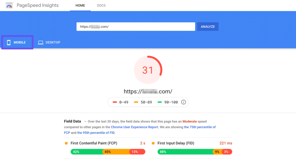
There are many free sites available that let you check your site’s speed and troubleshoot common issues. One of them is PageSpeedInsights. Start by entering your URL into Google’s PageSpeed Insights tool for page speed improvements.

It provides recommendations, some of which you can implement instantly, like compressing images. Others, such as optimizing HTML, JavaScript, and CSS, may require developer assistance.
If your in-house developer lacks the resources or time, consider investing in page speed optimization services. These services can improve your site’s page speed, enhancing conversion rates and leading to more sales and revenue.
This approach is favored by CRO experts due to its broad impact on the entire website.
7. Create a Sense of Urgency
Imagine receiving an email with the subject line, “Check out our new products.” This plain subject might not pique your curiosity.
Now, think about an email subject that says, “Last Chance: Exclusive 24-Hour Sale on New Arrivals!” This subject line is more likely to make you open the email because it creates a sense of urgency with a limited-time offer.
We’ve all made purchasing decisions influenced by the desire to stay on-trend or avoid the fear of missing out. This is a common human emotion that affects how we shop. We like being in the loop, and this feeling often guides our choices.
To see how this principle works, consider visiting Amazon and searching for flashlights. You’ll likely find some flashlights with a message like “Only a few in stock” displayed below the item.
This message essentially tells shoppers, “Other people trust and prefer this item over others.” If you’re not too specific about the flashlight you want, you should lean towards the brand with limited stock, assuming it’s popular.

This approach is evident in various aspects of business, such as events or webinars. If you spot an ad for a webinar on social media, you might scroll past it unless it’s a topic that greatly interests you.
But if you see another ad saying, “Register now! Only 10 spots left!” you’re more likely to consider attending because it seems like your industry peers find value in it.
What is a Good Conversion Rate Channel- Wise?
The average conversion rate varies by channel and can fluctuate over time and across different industries. Let’s understand how.
- Average E-mail Marketing Conversion Rates
There is no significant answer as to what is a good E-mail conversion rate, and it mostly depends on the industry you are involved in. A sound strategy is to consider any conversion rate surpassing your current one as an improvement and make consistent efforts to enhance it.
If your email conversions are low, it clearly signals that your email campaigns require substantial rethinking and enhancement.
- Average Conversion Rate of Facebook Ads and Google Ads
Wordstream discovered that Facebook ads have an average conversion rate of approximately 9.21% across various industries. This range stretches from 14.29% for the fitness industry to 2.31% for the technology sector. This discrepancy can be attributed to the reasons people use social media. Most individuals use Facebook for socializing and personal enhancement rather than actively seeking technology solutions.
Google Ads exhibit a similar broad spectrum of conversion rates. Industries like Animals and pets and Physicians and surgeons enjoy higher conversion rates exceeding 15%, while sectors like Fashion and jewelry, Furniture, and Real Estate linger below 4%.
It’s evident that the question, “What is a good conversion rate?” often yields the answer, “It depends.”
- Average Conversion Rate of LinkedIn Ads
According to data from HubSpot, LinkedIn ads in the United States have been associated with an impressive 6.1% conversion rate from U.S. customers.
Whereas LinkedIn states that their average Click-through rate for their sponsored content is 0.44%, for their dynamic ads, the CTR can be around 0.08% and for text ads, it is 0.025%.
Final Words
As digital marketers, we know how important it is to increase the click-through rate and prompt the leads to take action.
While optimizing your conversion rate doesn’t guarantee instant and dramatic results, it does have a significant impact on your revenue and sales cycle. It’s crucial to understand that CRO methods are not universally applicable; there’s no one-size-fits-all solution.
It’s essential to evaluate what conversion rate optimization strategies are effective for your specific business and implement them accordingly to witness an uptick in conversions. Patience and persistence are key while implementing these CRO strategies.
For more insights on how Conversion rate optimization strategies can be a game changer, feel free to contact LeanSummits.


